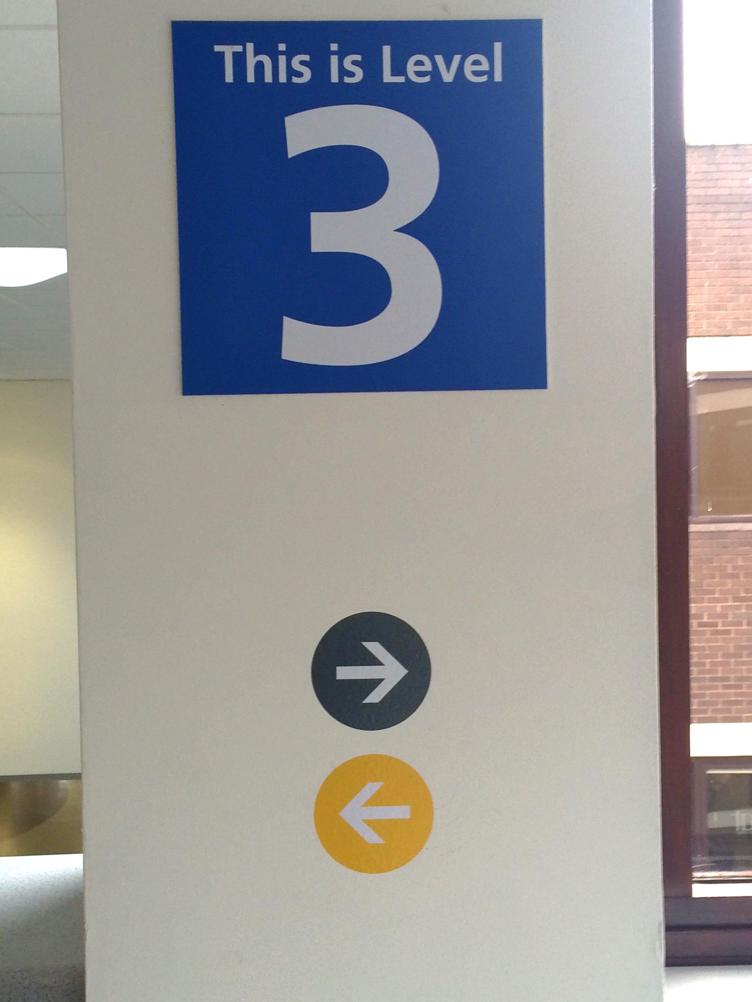
A survey of 50 visitors to the hospital showed that 94% felt the signage was poor and needed improving.
Solution: The porters met to discuss and share their views on what they felt would help and collectively they agreed on a a colour-coded system. They suggested using colour coded lines along the walls to guide people to where they needed to go; making the porters lives easier as they would be able to tell relatives, for example; “just follow the red line on the wall and that’ll take you straight to A&E”.
This would also improve the experience of anyone visiting the hospital. They mocked up some drawings of what this might look like and tested the idea with a further 50 visitors who unanimously thought that this would be a good improvement.
Outcomes and Benefits: As a result of this 'Be the Change' proposal, colour coded dots have now been introduced around the hospital directing visitors to key and high use areas such as outpatients, A&E and wards. The head of security, reports that he has received positive feedback from staff about the dots and that his team have experienced a reduced demand for wheelchairs to take patients from one area to another as a result. He also reports that departments such as MRI, Haematology and Pathology are being found more easily now.

