A funnel plot is a scatter plot of rates against population size.
It compares results from different populations over the same period, e.g. the referral rate for a particular condition from a number of GP surgeries.
The chart’s mean and limits identify populations for whom the rate is unusually high or low.
As significance depends on both population size and rate, outliers may not be those with the highest or lowest rates.
A point which falls outside these limits is unusual and you need to investigate it further.
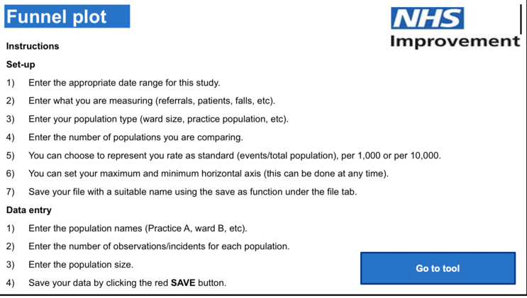
With this tool you can:
- compare populations
- identify outliers from annotations on the chart
- display all data points in a table and see which fall outside the limits
You can find the tool here